Styling Mollie Components
Mollie Components can be fully styled to ensure a smooth blend-in with your checkout. Check out what is possible in our Components Examples repository.
How to style a component
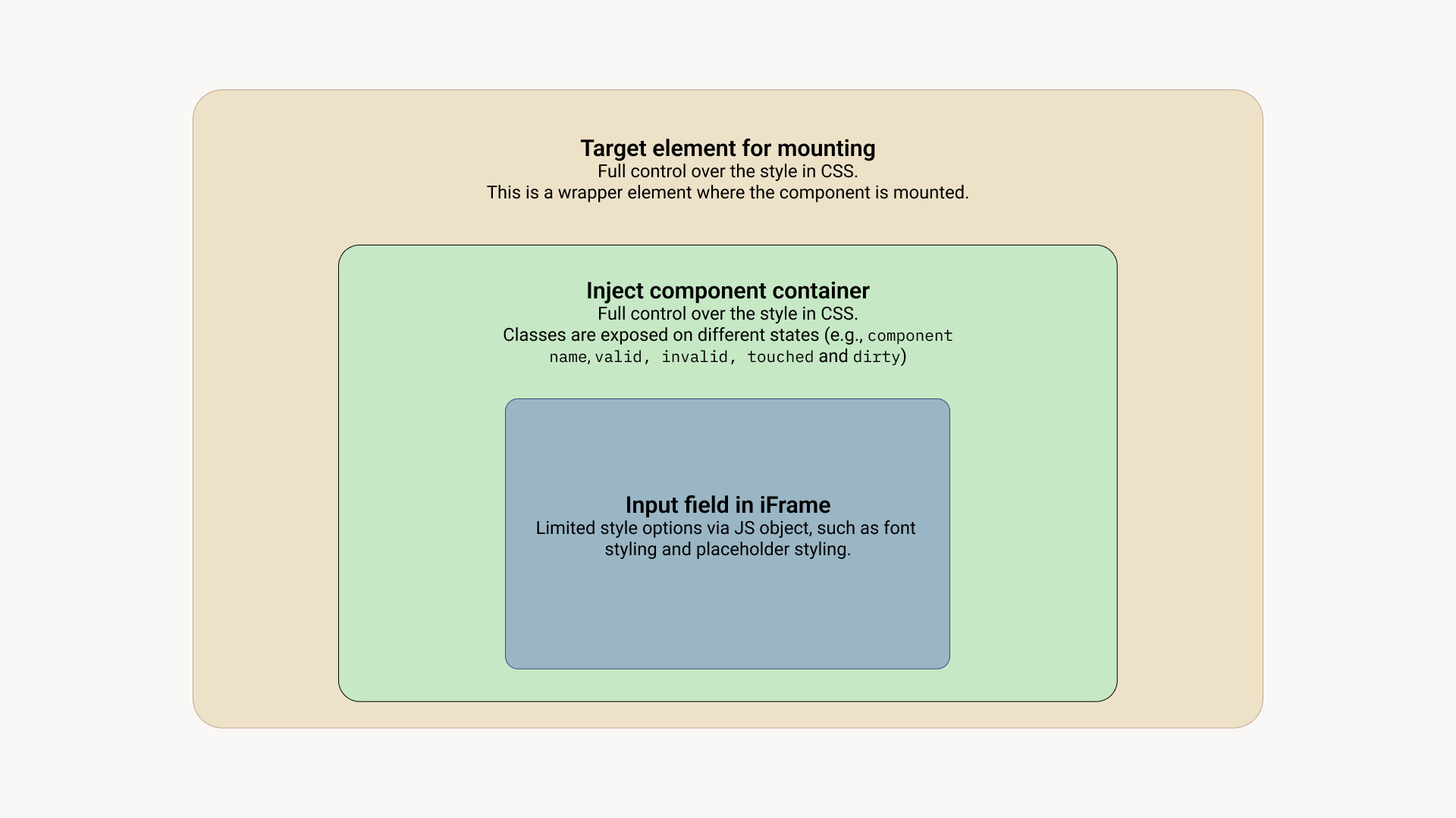
Most of the styling should be applied to the injected .mollie-component container. The <div className="mollie-component"></div> container lives completely in your own environment and thus will give the most flexible way of styling.
To see how this works, visit our Components Examples repository for examples.
.mollie-componentWill always be present. You can use this class to style border and background properties..mollie-component--<component name>The component will be identified on the component name itself. This can be used to target one specific component..mollie-component--is-loadingIndicates that the component is still loading. It will disappear after the component is loaded.
We also set some dynamic classes to reflect the state of the component as the user interacts with it:
.is-touchedThis class is set when the component receives focus for the first time. You may use this class in combination with another class to style error states..is-validThis class is set when the input contents are valid. You may use this class to give feedback to the user before submitting the form..is-invalidThis class is set when the input contents are invalid. You may use this class to give feedback to the user before submitting the form..has-focusThis class is set when the component has received focus and removed when the element has lost focus. You may use this class to outline the field so the user knows the component is interactive.
Styling text-related properties
Text styling properties related properties in the input field itself can't be styled from outside the iframe because iframes will block CSS inheritance. These properties can be applied when creating components. You can target different states of the component when applying them:
| State | Description |
|---|---|
base | The state of the Component when your customer has not entered any data yet or is entering data. These styles will also become the default styles for the valid and invalid states. |
valid | The state of the Component when your customer has entered valid data, such as a valid credit card number. |
invalid | The state of the Component when your customer entered invalid data, such as an expiry date in the past. |
For each of these there is an set of properties you can use:
backgroundColorof typecolorcolorof typecolorfontSizeof typenumberfontWeightof typestring|numberletterSpacingof typenumberlineHeightof typenumbertextAlignof typestringtextDecorationof typestringtextTransformof typestring
Every property has one or more types. Multiple types are indicated by a | character. We do not allow URL, http, https, and www.
stringA valid string, spaces aren't allowed,numberA valid CSS number with an optional unitpx,emorrem.colorWe accept colors as#f00,#ff0000,rgb(a),hsl(a)andtransparent,
We allow the following pseudo-classes. These will be autoprefixed and can be nested with the above listed properties.
::placeholder
Example
var options = {
   styles : {
     base: {
       color: '#eee',
       fontSize: '10px',
       '::placeholder' : {
         color: 'rgba(68, 68, 68, 0.2)',
       }
     },
     valid: {
       color: '#090',
     }
   }
 };

 var cardNumberEl = mollie.createComponent('cardNumber', options)
Updated 3 months ago